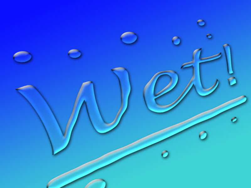
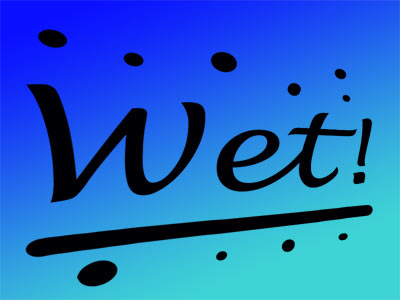
In this tutorial we'll learn how to make wet looking text along with very realistic looking water drops. This effect is quick and easy to achieve. Here's an example of the finished product:
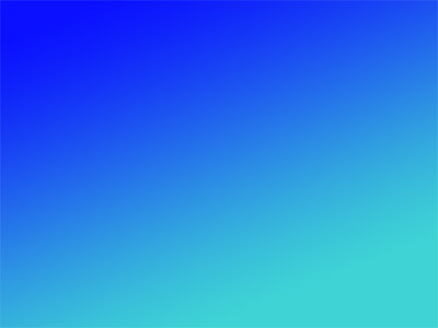
We'll start out with a simple gradient for our background, so create a new image with a transparent background. For my example here, I made the image 800 pixels wide by 600 pixels.
Next, I set the foreground color to #0a10ff and the background color to #3ed3d5. You can choose other colors to suit your needs, though the water effect looks best against blue. Once you have your colors selected, choose the Gradient Tool and swipe out a gradient. I created mine on a diagonal to make it a bit more interesting looking, but you can choose whatever look you want.
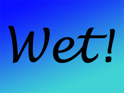
Now let's add our text. I chose the Lucida Handwriting font. Any font will work, of course, but a font that has smooth flowing letters will create a better wet text look. I set the point size to 300 and the text color to black. It doesn't matter what color you use for the text because we will remove it later on. Don't worry about the position of the text because we're going to move it soon. Finally, rasterize the text by selecting Layer->Rasterize->Type.
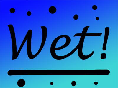
Now let's add some water drops to make it more interesting looking. We'll do this with paintbrush tool Set the foreground color to black and choose a regular round brush tip. Set the size to 35 and opacity and flow to 100%. Now draw a line under the text to add some emphasis to it. Just draw it free hand since it doesn't have to be perfectly straight, in fact it looks better if it isn't. To make water drops, just paint some circles with brush. I just touched the brush in a few random places while varying the brush size. For a few of them, I drew a very short line just so a few of the drops wouldn't be perfectly round. This will make it look more like real water droplets.
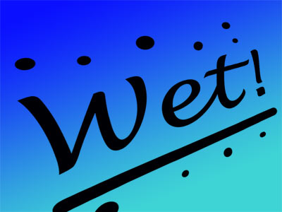
Next we'll put the text on an angle and make it recede a little into the distance. This is just to make it look a little more interesting and you can skip this if you want.
First, choose Edit->Transform->Perspective and grab the handle on the upper right corner. Move the handle down slightly to squeeze the right side a bit.
Now choose Edit->Transform->Rotate and rotate the layer so that the text more or less aligns with the angle of the gradient. Move the text if needed to make it line up with where the two colors in the background gradient cross over. We'd like to have the center of the text align on top of the cross over point between the lighter and darker color to maximize the effect.
Time to create the water effect by using a Layer Style. Select Layer->Layer Style->Drop Shadow to bring up the Layer Styles dialog box. Set the style as indicated here:
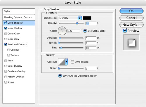
Don't click OK just yet since we have to set more options.
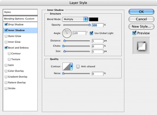
Now click on Inner Shadow and use the settings as indicated here:
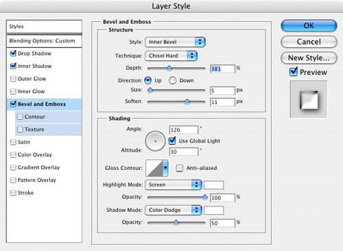
Next up are the settings for Bevel and Emboss:
The final setting is in Blending Options: Custom up at the top of the list on left side of the dialog box:
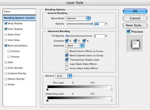
The important setting is to set the Fill Opacity to zero. This removes the color of the text itself and just leaves the effect. Now it's time to click OK and see the result of all these effects:
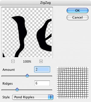
What we have looks pretty good and you can stop here if you want. I'm going to add one more step to make it a bit more interesting looking by adding just a little distortion to make it look a little more fluid. With the layer containing the text and water droplets still selected, choose Filter->Distort->Zig Zag and use the settings shown here:
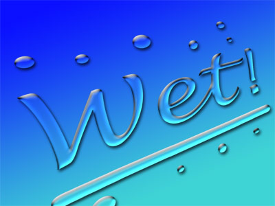
This just adds a little fluid waviness to our wet text and makes it look a little more liquid. If you prefer the more gel-like look we had at the end of Step 8, then just omit this last step. Here's the final product:
You can of course vary the settings I've used here. The ones I've provided are just to give you a starting point
We'll start out with a simple gradient for our background, so create a new image with a transparent background. For my example here, I made the image 800 pixels wide by 600 pixels.
Next, I set the foreground color to #0a10ff and the background color to #3ed3d5. You can choose other colors to suit your needs, though the water effect looks best against blue. Once you have your colors selected, choose the Gradient Tool
and swipe out a gradient. I created mine on a diagonal to make it a bit more interesting looking, but you can choose whatever look you want.Now let's add our text. I chose the Lucida Handwriting font. Any font will work, of course, but a font that has smooth flowing letters will create a better wet text look. I set the point size to 300 and the text color to black. It doesn't matter what color you use for the text because we will remove it later on. Don't worry about the position of the text because we're going to move it soon. Finally, rasterize the text by selecting Layer->Rasterize->Type.
Now let's add some water drops to make it more interesting looking. We'll do this with paintbrush tool
Set the foreground color to black and choose a regular round brush tip. Set the size to 35 and opacity and flow to 100%. Now draw a line under the text to add some emphasis to it. Just draw it free hand since it doesn't have to be perfectly straight, in fact it looks better if it isn't. To make water drops, just paint some circles with brush. I just touched the brush in a few random places while varying the brush size. For a few of them, I drew a very short line just so a few of the drops wouldn't be perfectly round. This will make it look more like real water droplets.Next we'll put the text on an angle and make it recede a little into the distance. This is just to make it look a little more interesting and you can skip this if you want.
First, choose Edit->Transform->Perspective and grab the handle on the upper right corner. Move the handle down slightly to squeeze the right side a bit.
Now choose Edit->Transform->Rotate and rotate the layer so that the text more or less aligns with the angle of the gradient. Move the text if needed to make it line up with where the two colors in the background gradient cross over. We'd like to have the center of the text align on top of the cross over point between the lighter and darker color to maximize the effect.
Time to create the water effect by using a Layer Style. Select Layer->Layer Style->Drop Shadow to bring up the Layer Styles dialog box. Set the style as indicated here:
Don't click OK just yet since we have to set more options.
Now click on Inner Shadow and use the settings as indicated here:
Next up are the settings for Bevel and Emboss:
The final setting is in Blending Options: Custom up at the top of the list on left side of the dialog box:
The important setting is to set the Fill Opacity to zero. This removes the color of the text itself and just leaves the effect. Now it's time to click OK and see the result of all these effects:
What we have looks pretty good and you can stop here if you want. I'm going to add one more step to make it a bit more interesting looking by adding just a little distortion to make it look a little more fluid. With the layer containing the text and water droplets still selected, choose Filter->Distort->Zig Zag and use the settings shown here:
This just adds a little fluid waviness to our wet text and makes it look a little more liquid. If you prefer the more gel-like look we had at the end of Step 8, then just omit this last step. Here's the final product:
You can of course vary the settings I've used here. The ones I've provided are just to give you a starting point

